These days, more than half of internet traffic comes from mobile devices (according to Statista) so it’s more important than ever to make sure your website looks good not just on desktop (in various browsers and at various resolutions), but on mobile phones and tablets as well.
We didn’t invent responsive web design, but we know how to do it! And we can answer your questions about what it is, why you need it, and how to get it. Here are some questions our clients frequently ask us about responsive site design:
What is responsive web design?
We’re not trying to cop out, but the best way to learn about responsive website design is to read this article from Treehouse. It’s a 10-minute read and will give you a quick primer on everything you need to know. The article is 5 years old—which shows you just how long responsive site design has been a thing—yet it is still accurate and up-to-date.
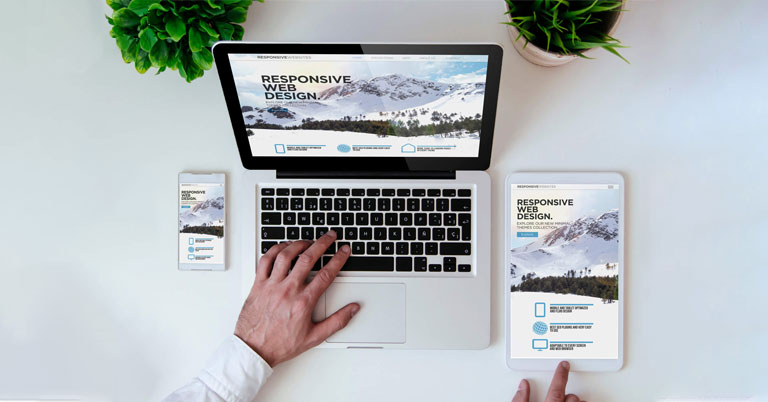
But in short, responsive web design means ensuring that your content (image, copy, menu, etc.) displays well across all devices (desktop, phones, tablets). And it’s still important to test across browsers as well.
Remember, the internet is not the same medium as print. You can’t always get everything pixel perfect—tweaking a line of text to look great on your iPhone X might make it look worse on someone’s desktop running Windows 10—so it’s important to look at the bigger picture of how things are displaying. Is the text the right size proportional to the screen? Are buttons easy to click? Are any images getting cut off? When you’ve covered these points for the most common screen sizes, you’re a good part of the way there.
Is responsive web design the same as being mobile-friendly?
Kind of. You could say they’re cousins. They are at least related. If a website is responsive, it will be mobile-friendly because by definition it responds to any screen size and renders well. But the inverse is not necessarily true—just because a site is mobile-friendly doesn’t mean it’s responsive. The only requirement to be mobile-friendly is that it looks fine on mobile. That doesn’t mean it’s optimized for mobile and it doesn’t mean it provides the best experience possible across all devices.
Does my website really need to be responsive?
That depends. As you can see from the Statista report above, 52% of internet traffic in 2018 came from mobile devices, so that makes a pretty good case for ensuring your site renders well for those people. However, if you look at your own website stats (for example, using Google Analytics), you may see a different trend. If you work in a B2B industry, the majority of your audience may be on desktop. It might not be worth redesigning your entire site if only a small percentage of your audience is on mobile.
Then again, why not? Why miss out on ANY traffic? Particularly traffic from a segment that is growing; even if mobile traffic doesn’t make up a large percentage of your total traffic today, that doesn’t mean it couldn’t do so down the road.
Additionally, a website’s mobile-friendliness is a factor Google has been taking into consideration since 2015 when ranking your website (read the official announcement from Google). So even if you don’t particularly care about mobile traffic, Google does. And if you want your site to rank high in Google, you’ll need to be sure it provides a positive user experience for mobile users.
Do I need two different sites—one for desktop and one for mobile?
Nope. In fact, in most cases we advise against it. (And Google does too.) Having two sites means you now have twice as much to maintain, which means double the work and some updates potentially slipping through cracks. And, really, if you apply the principles of responsive web design to your entire site, then your site will already be mobile-friendly.
Is there a way to check if my website is mobile-friendly?
Yep! Google thinks it’s so important that a site be mobile-friendly that they provide a handy tool for checking how your site measures up.
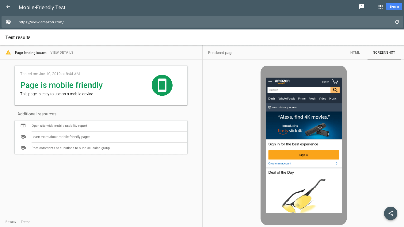
How Amazon.com scores according to Google’s Mobile-Friendly Test
What types of things would you hide on mobile?
This depends on the project, the goals, the users, etc. but some options for what you might keep on a desktop version of a site but remove as you “go responsive” (reduce screen size) are:
- Background images or videos
- Submenu items
- Lower hierarchy content
- Multiple calls-to-action
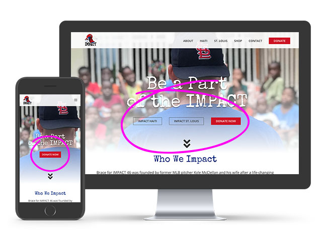
For example, the website we built for Brace for IMPACT 46 (a non-profit supporting Haiti and North St. Louis) slims down noticeably as you decrease screen size. On the full website, we offer options in the main banner on the home page to donate to Haiti or North St. Louis as well as the general “Donate Now” button; on mobile, we only offer the general “Donate Now” option.
What types of things would you treat differently on mobile?
In some cases, you don’t want to remove something on mobile but you do want to treat it differently. Here are some options:
- For any items that appear in a horizontal row on desktop, display them in a vertical column on mobile so that the user only has to scroll down, not across (and to avoid making the content too small—which is what happens when too much content is forced to fit in a horizontal space at a small screen size).
- Make use of a hamburger menu instead of horizontal navigation.
- Make buttons/text larger to improve readability and usability.
- Display a lower-resolution version of an image to improve page speed.
- Adjust content length (for example, consolidate copy from 150 words to 50).
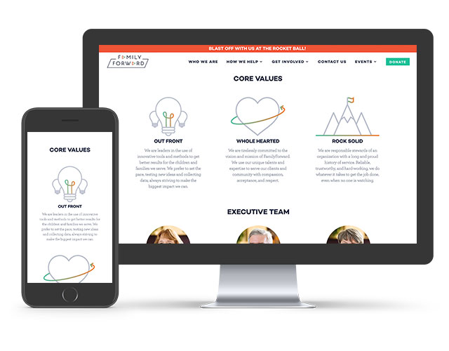
On the Who We Are page of the website we built for FamilyForward (a non-profit that helps families in the St. Louis area), we take the horizontal rows on desktop and display them vertically on mobile.
As you can see, responsive site design is something that requires a bit of thought in order to ensure you’re providing a great experience for all your users across any device they choose to use. When you take the time to ensure your site is responsive, you have a good chance of seeing increased engagement and improved search engine rankings. If you’d like to redesign your website so that it displays well for all of your visitors, we can help!