Forms are one of the most important aspects of your website. They create pathways for users and businesses alike to reach their goals. A well-designed form can increase conversion rates and have a positive effect on your site’s overall usability.
Here’s a quick list of low-effort ways to optimize your form design:
Choose user-friendly, concise language.
Wordy language creates visual clutter, making it difficult to quickly comprehend the objective of the form. Double-check that your copy is easy to understand at a glance.
Eliminate unnecessary fields – only ask for what you absolutely need.
If you can eliminate extra fields, do it. Upon being presented with a form, users will quickly scan the fields to decide whether or not to fill it out. Let’s face it, we all like to take the quickest and easiest route when possible. A short form will often perform better than a long one, because it requires less effort and time.
Don’t worry about the extra data you’d like to collect but don’t necessarily need – you can always ask for more information later, after you collect the initial user data.
Provide necessary context and field requirements.
Guiding your users along the way prevents frustration and form errors. If your form fields require certain formatting or requirements, make sure the rules are visible.
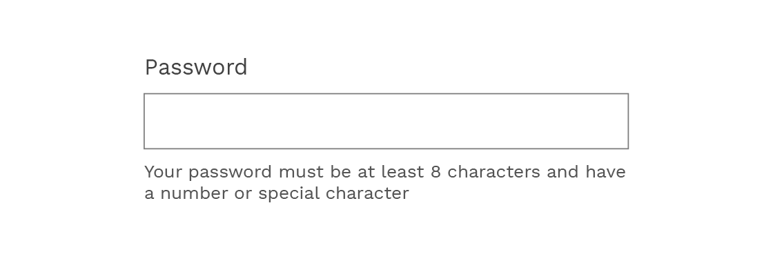
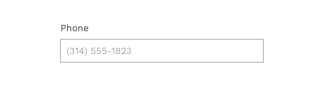
You can also use placeholder text that shows the correct formatting for fields such phone numbers or dates.
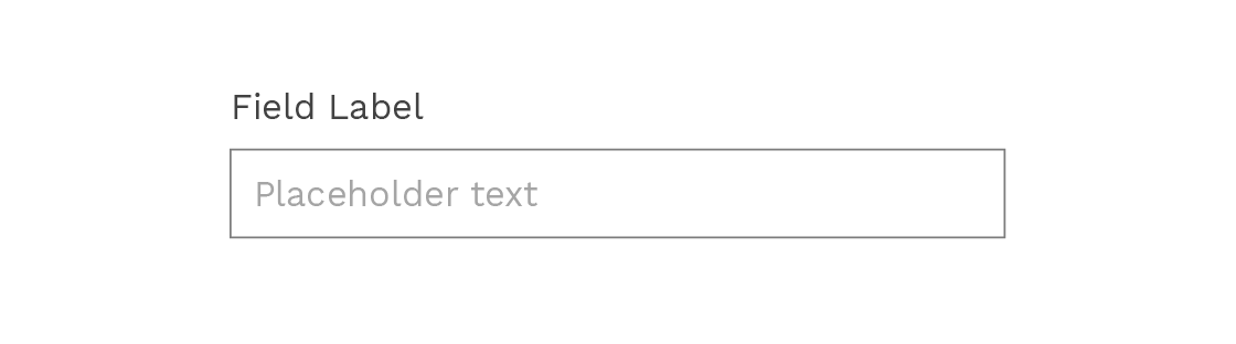
Don’t replace field labels with placeholder text.
Placeholder text within a form field should never replace the field label itself. Utilize both (shown below), or only use a field label.
There are many reasons to avoid using placeholder text as a field label:
- It’s less noticeable and can be overlooked.
- It disappears when the user begins to type. If a user forgets the placeholder text after filling out a field, they have to delete what they wrote and sometimes click away to see it again.
- It may not be set at a high enough contrast to pass ADA compliance, and users that depend on accessible design might not be able to complete the form at all.
Most importantly, placeholder text is not accessible for many users that rely on accessible design and assistive technology, not only those with visual impairments.
Stick to a one-column layout, except fields that go together logically should be inline.
Decrease clutter and increase scanability even more by using a one-column layout. An exception is for fields that logically group together (i.e. city/state, birth day/month/year, etc.).
Create a descriptive and clear action button.
The action button triggers the form submission, so we need to make sure that it’s designed as effectively as possible. Here are a few ways to do that:
- Create an actionable button label by finishing the sentence “I want to…” (ex. I want to… “Sign Up,” “Enroll,” “Book Flight,” “Send Message,” etc.) Avoid generic labels such as “Submit.”
- Make it stand out – use clean typography and adequate contrast. If there is more than one button on your form, make the action button prominent and unique.
Provide feedback.
It’s important to provide as much context as possible. Error and validation messages should always be included in your form design.
Error messages need to be clear – tell the user exactly how to fix the problem, and use visual indicators to draw their eye to the error.
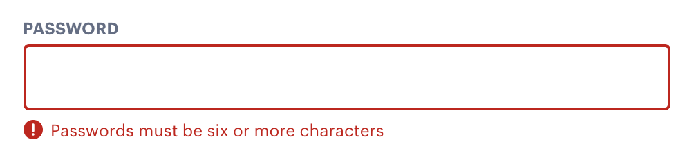
If possible, include inline validation: when the user introduces a wrong type of data, or the wrong format in the field, prompt them of the error and how to fix it immediately.
If there are no errors on submission, a validation message should appear. Without a validation message, users will question if their form was successfully submitted. This can lead to confusion, as well as duplicate form entries if the user decides to resubmit the form.
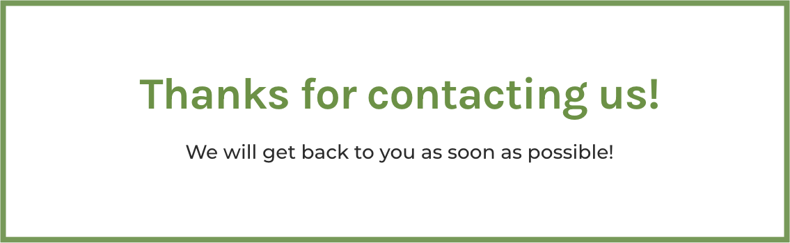
Improving your form design is a great way to increase conversion rates and usability. Good design increases your users’ satisfaction levels and helps your business meet its goals. If you would like to learn more about increasing form usability, or need help implementing such changes, get in touch with us!