
Every second of load time matters. Studies consistently show that page speed directly affects bounce rates, conversion, and even search rankings. And in most cases, images are the single biggest culprit behind a slow page. The good news? Image optimization is one of the highest-leverage improvements you can make — and most of it requires no backend changes at all.
This guide walks through every meaningful optimization technique, from format selection to lazy loading, with practical code you can drop in today.
Not sure where to start? Reach out to us! We offer a free site evaluation and page speed report to get you started on optimizing images for SEO.
1. Choose the right file format
Format choice is your first and most impactful decision. There’s no universally “best” format. The right choice depends on what your image contains and where you’re using it.
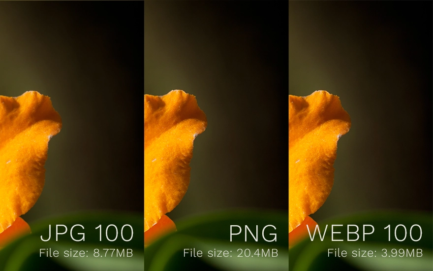
- JPEG — Best for photographs and complex images with smooth gradients. Lossy compression keeps file sizes small, but it doesn’t support transparency.
- PNG — Best when you need transparency. Lossless, so files are larger than JPEG for photos.
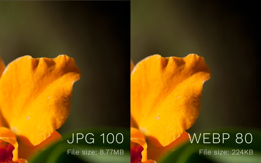
- WebP — A modern format from Google that outperforms both JPEG and PNG. Supports transparency, lossy and lossless modes, and typically cuts file sizes by 25–35% compared to JPEG at equivalent quality. TPI prefers this format for most photo-type images on the web.
- AVIF — The newest and most efficient format. Offers even better compression than WebP, but browser support is still catching up (looking at you, legacy Safari and IE).
- SVG — For logos, icons, and illustrations. Resolution-independent vector format that scales perfectly at any size with tiny file sizes.
2. Compress without sacrificing quality
Even after choosing the right format, you should always compress your images before uploading. There are two compression modes:
- Lossy compression permanently removes data to shrink the file. JPEG and WebP (lossy mode) use this. A quality setting of 75–85% is usually imperceptible to the human eye while cutting file size dramatically.
- Lossless compression reorganizes data without discarding any of it. PNG uses this. You won’t lose quality, but savings are more modest.
Tools worth bookmarking: Squoosh (browser-based, great for experimentation), TinyPNG (simple drag-and-drop), ImageOptim (Mac desktop app), and Sharp (Node.js library for automated pipelines).
~35%
Average WebP savings vs JPEG
~50%
Average AVIF savings vs JPEG
~26%
Average WebP savings vs PNG

3. Resize images to their display dimensions
A camera photo might be 4000 × 3000px and several megabytes. If it’s displayed in a 800px-wide blog column, the browser still downloads all 4000 pixels and then scales it down in the renderer, wasting significant bandwidth and memory.
Always resize images to the maximum size they’ll actually be rendered at before uploading. If the largest breakpoint in your design shows the image at 1200px wide, export it at 1200px wide (or 2400px for high-DPI screens. See responsive images below).
A good rule of thumb: if you’re opening an image straight from a camera or stock photo site without resizing, you’re almost certainly shipping it too large.
4. Use responsive images
Different screens need different image sizes. A mobile user on a 375px viewport shouldn’t download the same image as a desktop user on a 1440px monitor. HTML provides two native attributes to solve this: srcset and sizes.
<img
  src="hero-800.jpg"
  srcset="hero-400.jpg 400w,
          hero-800.jpg 800w,
          hero-1600.jpg 1600w"
  sizes="(max-width: 600px) 100vw,
         (max-width: 1200px) 80vw,
         760px"
  alt="A scenic mountain landscape"
/>
The srcset attribute lists your available image files and their widths. The sizes attribute tells the browser how wide the image will be rendered at different viewport sizes. The browser does the math and downloads only what it needs.
(Psst, if your site uses WordPress, it does this for you!)
5. Adopt modern formats with a fallback
WebP and AVIF offer meaningfully better compression than legacy formats, but older browsers (particularly older Safari and IE) don’t support them. The <picture> element lets you serve modern formats to supporting browsers while gracefully falling back for everyone else.
<picture>
  <source srcset="hero.avif" type="image/avif">
  <source srcset="hero.webp" type="image/webp">
  <img src="hero.jpg" alt="A scenic mountain landscape">
</picture>
Browsers try each <source> in order and use the first format they support. The <img> tag at the end is the universal fallback.
6. Lazy load images below the fold
Not every image on your page needs to load immediately. Images that are off-screen when the page first renders can be deferred until the user scrolls near them. This reduces initial page weight and speeds up time-to-interactive significantly on image-heavy pages.
The native loading="lazy" attribute makes this effortless:
<img src="photo.webp" loading="lazy" alt="...">One important caveat: Never lazy load images that are visible in the initial viewport — particularly hero images and above-the-fold content. Doing so delays the Largest Contentful Paint (LCP), which is a Core Web Vital that directly impacts your search ranking.
7. Use a CDN for image delivery
A Content Delivery Network (CDN) caches your images on servers distributed around the world and serves them from the node geographically closest to each user. For a visitor in Tokyo accessing a site hosted in Virginia, a CDN can cut image load times by hundreds of milliseconds.
Many modern CDNs (Cloudflare Images, Imgix, Cloudinary, and Vercel’s image optimization) also perform on-the-fly transformations: resizing, format conversion, and quality adjustment, all based on URL parameters or request headers. This eliminates the need to pre-generate every image variant yourself. (A great time-saver in development!)
8. Set aggressive cache headers
Images change infrequently. Once a browser has downloaded a logo or a product photo, it should cache it for as long as possible so repeat visits don’t re-download assets. Set a long Cache-Control header on your image responses:
Cache-Control: public, max-age=31536000, immutableThis tells browsers (and CDNs) to cache the image for one year. The immutable directive signals that the file will never change at this URL which prevents revalidation requests even during hard reloads. When you update an image, change its filename (or add a content hash to the URL) to bust the cache.
9. Always write meaningful alt text
Alt text isn’t a performance optimization, but no image guide is complete without it. The alt attribute serves three purposes: it’s read aloud by screen readers for visually impaired users, it’s indexed by search engines and contributes to image SEO, and it displays as fallback text when an image fails to load.
Accessibility is the new black: Good alt text describes what the image shows and why it’s relevant in context, not just “photo” or “image.” For decorative images that convey no information, use an empty
alt=""attribute so screen readers know to skip them.
10. Measure, then optimize
Optimization without measurement is guesswork. Before and after making changes, run your pages through these tools to quantify the impact:
- Google PageSpeed Insights — Audits your live URL and provides specific, actionable image recommendations with estimated savings.
- Lighthouse — Built into Chrome DevTools. Run it locally to catch issues before deploying.
- WebPageTest — More detailed than PageSpeed, with filmstrip views and waterfall charts that show exactly when each image loads.
- Chrome DevTools Network tab — Filter by “Img” to see every image your page loads, its transfer size, and how long it took.
Drop us a line to get a free audit and page speed report to start the conversation about image optimization for your site!
The Takeaway: Image optimization is rarely a one-time project, but rather an ongoing discipline. The techniques here compound: a WebP hero image, delivered via CDN, content photos lazily loaded below the fold, and correctly sized for each breakpoint can reduce your total image payload by 80% or more compared to naïve defaults. That translates directly into faster pages, lower bounce rates, and better search engine rankings. Contact us to get started on optimizing your website!