
If you groaned reading that title, then clearly you’re not as big of a web marketing analytics nerd as we are. So we guess that means you don’t know pi out to 20 decimal places? Neither do we. (3.14159265358979323846.)
In honor of Pi Day, we thought it would be appropriate to share some pie charts of our own stats. Because if there’s anything we love more than irrational numbers, it’s data. Lots and lots of data.
At Thoughtprocess Interactive, it’s standard practice for us to set up Google Analytics for our clients. We track web performance on an ongoing basis so we can spot anomalies—both good and bad. This helps us fix errors, like a recent issue we discovered with a handful of incorrect URLs on a website. It also helps up spot unexpected traffic sources, like a client who said “we don’t get much traffic from Pinterest” and it turns out their site gets 3,000 visitors per month from Pinterest!
From data like this, we can make actionable recommendations. Fix the broken URLs. Implement a more robust Pinterest program. Data allows us to make metric-based suggestions and to subsequently track the results. That’s all part of our pragmatic approach to web marketing.
Um, I thought you said something about pie charts and web marketing analytics?
Right. Excuse us for that tangent (and further excuse us for that awful pun). Below are some pie charts representing web marketing analytics for our own website.
Device Usage
(Source: Google Analytics, Audience, Mobile, Overview)
As more and more people check their email and browse the web on their phones, having a website that displays well on all devices is crucial. Certain businesses will still see most of their traffic come from a traditional desktop computer, but that doesn’t mean they can’t optimize for mobile users.
And for those that receive a large amount of traffic from mobile devices, it’s not only important to have a site that displays well but one that is easy to use. Have you minimized the number of clicks it takes to get to your important content? Do you save certain information (personal info, credit card info) so that users don’t have to go through the laborious process of re-keying it on their phones? Have you reviewed your entire site from a mobile device and rated the user experience? (If you have any questions about mobile-friendliness, here are some answers.)
We love helping our clients with user experience testing like this and making their web marketing analytics work for them. We figured we should see how our own site rated as well.
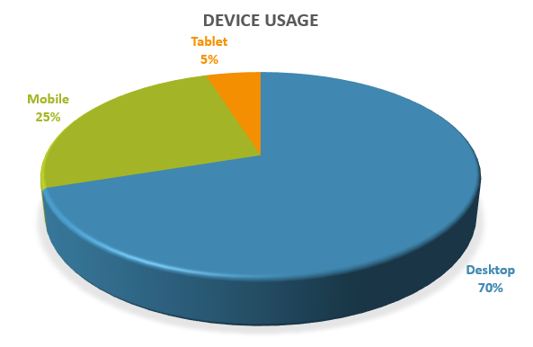
Web Marketing Analytics: Device Usage for ThoughtprocessInteractive.com
This pie chart shows, unsurprisingly, that most of our traffic comes from desktop users. We’re a B2B company that gets contacted primarily during business hours, so this makes sense. Most of our clients and potential customers are at work in front of their computers when they visit our website.
Since 30% of our traffic does come from mobile devices, we ran through our site one more time just to be sure the experience was optimal. It passed our test (whew!), but feel free to give us a shout if you notice anything funny.
Traffic Sources
(Source: Google Analytics, Acquisition, Overview)
Ever wonder where your web traffic comes from? Of course you do. This is the place to look. By checking out this report, you can get an idea of which of your online marketing tactics have paid off and which could use a little help.
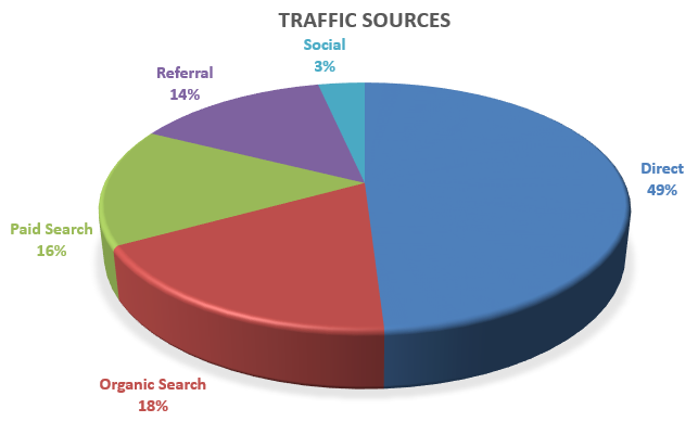
Web Marketing Analytics: Traffic Sources for ThoughtprocessInteractive.com
Our site gets most of its traffic from direct visits. This makes sense since (a) that’s typical of a lot of websites (this article has a great breakdown of the 9 different types of traffic that get labeled as “direct” traffic in Google Analytics) and (b) a lot of our business comes from word of mouth—meeting personally with clients and handing them our business cards, referrals from existing clients and agency partners, etc.
We also get about 18% of our traffic from organic search, which is great since SEO is one of the services we offer our clients. Good to know we know how to do it ourselves!
The rest of our traffic comes from a combination of paid search, other websites, and social media.
Social Traffic
(Source: Google Analytics, Acquisition, Social, Network Referrals)
Pretty much every website can benefit from social media exposure. But you can’t be all things to all people, and you can’t do a good job if you’re spread too thin across every social media network. We’ve found that Facebook and LinkedIn work best for us, and the pie chart supports that.
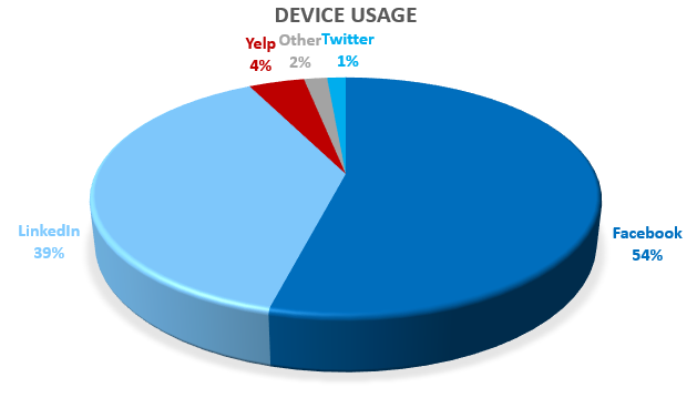
Web Marketing Analytics: Social Traffic for ThoughtprocessInteractive.com
Facebook allows us to show a bit of our personality and remind clients, agencies, friends, and anyone else who likes our page that we are here and available to help with their web design and development projects.
LinkedIn allows us to connect with other people and companies in the industry, as well as share ideas. It’s also a great way for us to find new people to add to our growing team.
Admittedly, the pie chart reflects somewhat of a self-fulfilling prophecy: we saw that Facebook and LinkedIn worked best for us so we focused our efforts there, and so understandably those will continue to be the biggest drivers of traffic to our site. Still, it’s worth looking at your own data in order to make that initial determination about where to focus. Then monitor the traffic as you try new techniques and launch new campaigns.
That’s great, now I want some pie
Us too. Particularly pumpkin pie with pumpkin whip cream and a pumpkin graham cracker crust. All these onling marketing stats are making us hungry. Happy Pi Day!