
When defining which content should go on your website, it can be tricky to prioritize it when everything seems important. Last month’s article, Prioritizing Content Around Key Audiences, covered that topic in broad strokes. This month we’ll delve deeper into one particular aspect of content prioritization: rotating content.
What Do You Mean by “Rotating Content”?
First, let’s make sure we’re talking about the same thing. Refreshing content on your website is a good thing. Google likes to see new, relevant, and timely content and so do your users. Try swapping out an evergreen home page banner with one for a specific event, holiday, or news item. This is a great way to use prime real estate on your site to engage your fans.
So we’re not talking about rotating in fresh content as applicable, we’re talking about widgets that move on your site to display different content in the same space. These are often called sliders or carousels. Sometimes the sliders rotate automatically, with a timer set to pause between each rotation, and sometimes the user is able to control the rotation. (And sometimes both are in place.)
The Pros of Rotating Content
There are certainly some benefits to using such elements to present your content:
- Website users have shorter and shorter attention spans these days, so movement could be a good way to catch their eye.
- It allows you to display more content in less space. Having 3 banners stacked on top of each other probably won’t look very good and would force users to scroll. Instead, you can just have one banner area taking up room on your page.
- It creates a mechanism where you can have one “evergreen” image/banner/element and then other time-sensitive pieces, all without having to change the design of your page. It’s essentially a built-in place for you to provide updates to your users.
The Cons of Rotating Content
There are also quite a few downsides to using such techniques:
- By presenting multiple messages, you risk diluting your main message. Now instead of one strong message and call-to-action, your users have multiple messages to choose between. When faced with too many decisions, users will often take none of the desired actions.
“In terms of space saving and content promotion a lot of competing messages get delivered in a single position that can lead to focus being lost.”
– Adam Fellowes
- Oftentimes, the widgets used to display such content will slow down a site’s page speed. Having fast page speed is more important than ever (again, because of users’ shorter attention spans) so you don’t want to do anything to slow them down unnecessarily.
- Particularly on mobile, with a smaller screen size and even shorter attention spans, you might not want to distract your users with all this movement and all these choices. It might be better to get straight to the content they’re most likely to be interested in.
- The rotating effect can trigger a response in some users that this is advertising content, which in turn gives them “banner blindness.” So not only do you risk them not flipping through to the other slides, they might even tune out the first slide.
- Even if users don’t tune out a particular slide, often the content rotates too quickly for them to fully digest it. And users won’t often go back to previous slides—once a new slide is presented, they are now focused on that. So you risk losing the few people who were actually interested in that content.
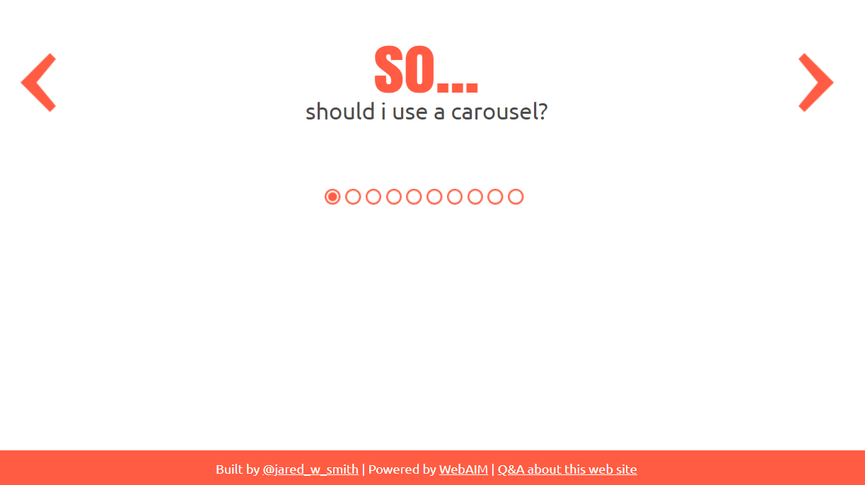
This hilariously meta website gives you some clear reasons not to use a carousel on your site:
Which One is the Winner: Slider or No Slider?
It depends. If upper management really wants all this content on the home page, using a slider could be the best way to accomplish that. Or if you have seasonal content that you want to promote without losing your evergreen content. Or if most of your users are on desktops with a high-speed internet connection.
But in most cases, you’ll be better served to focus on your primary call-to-action and go with that in the banner. Save the sliders for secondary content, like photo galleries or featured product carousels.
And if you must have a rotating slider in your main banner area, let the user control it as opposed to automatically rotating through the slides.
Be sure to keep these pros and cons in mind as you’re designing your site or considering updates to your site. If you’d like any guidance with web design, layout, buildout, or even just thoughts on best practices, get in touch with us!